Rediscover the joy of organizing—now faster, smarter, and more intuitive than ever before

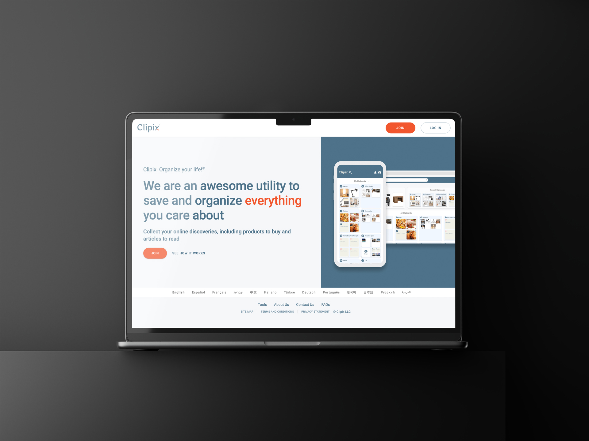
Clipix had been around for nearly a decade, a platform that helped people save and organize their favorite things online—articles to read, items to buy, photos to remember, and more. But after 9 years, the interface felt a bit… tired. It was time for a refresh. That’s when my team and I stepped in.

The mission? Breathe new life into Clipix without losing the familiarity its loyal users loved. This wasn’t just a visual refresh—it required a complete technical overhaul. After nearly a decade, we needed to modernize the tech stack, transitioning to React.js and adopting a component-based, atomic design approach.
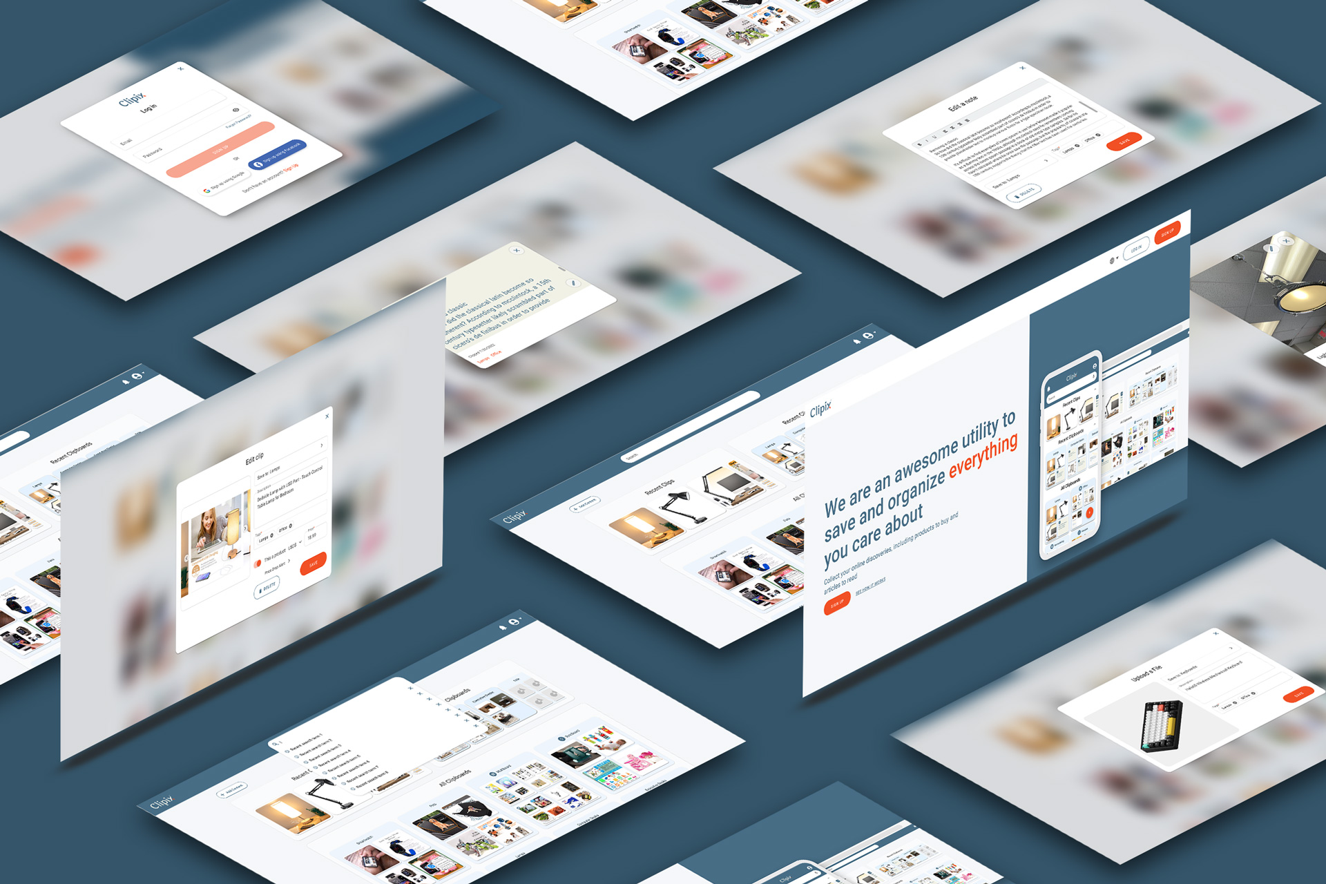
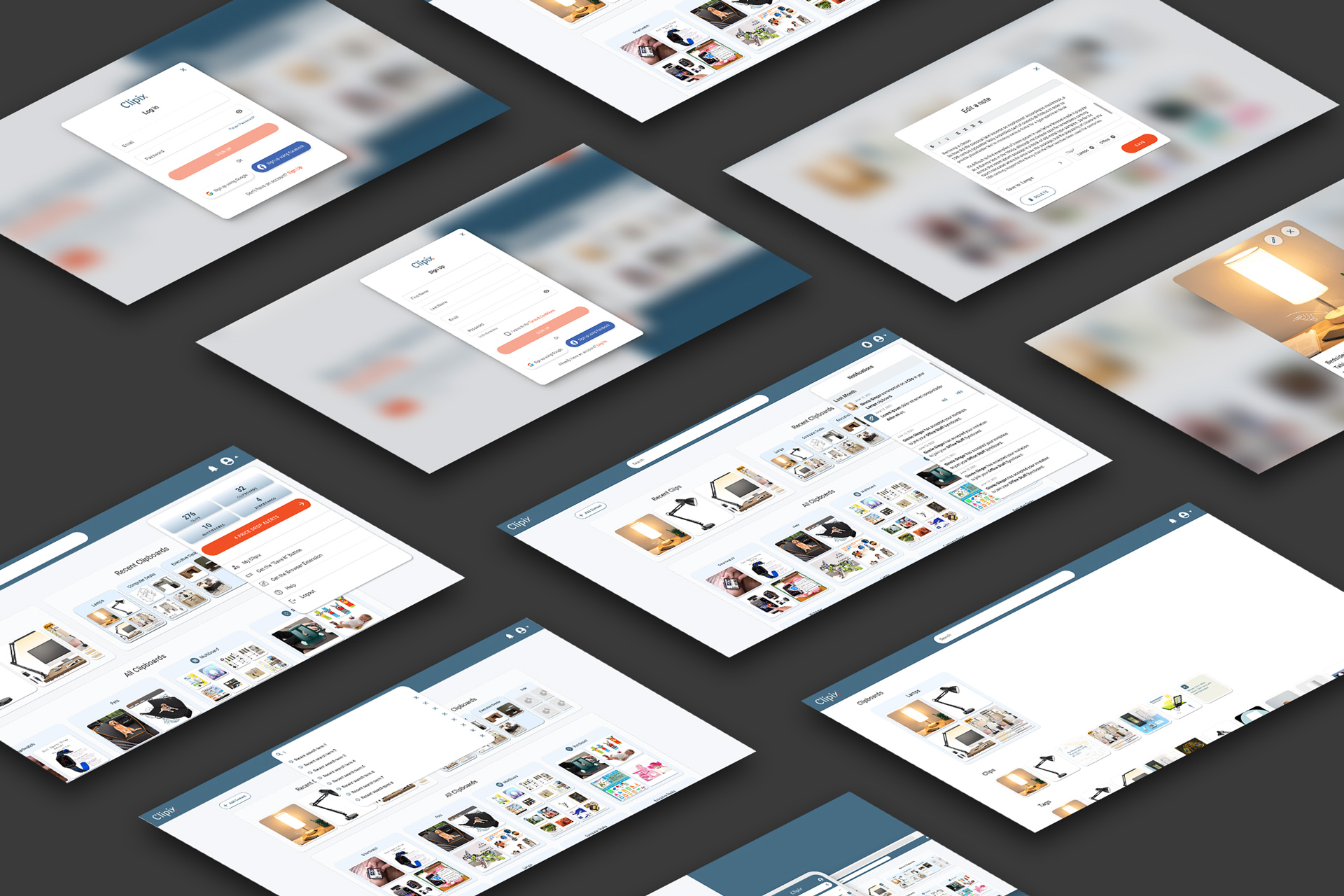
Every element, from buttons to complex interactions, was built from the ground up as reusable components, ensuring a consistent user experience across the app. The challenge was to make this transformation seamless for users, maintaining the simplicity they knew while integrating the power of a modern tech stack.


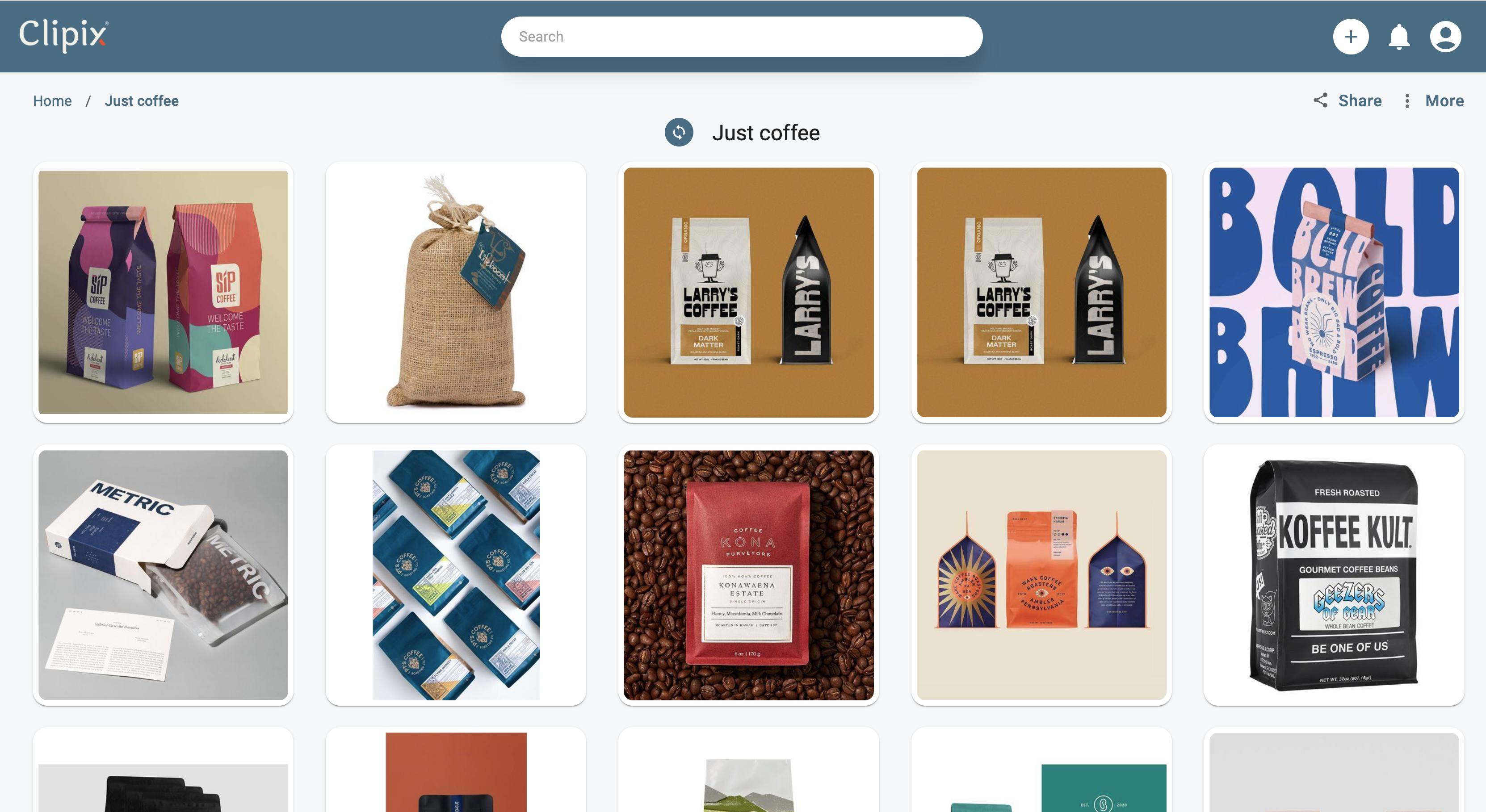
As part or the design team, I took charge of reimagining the entire web user experience. It wasn’t just about making Clipix look modern—it was about building a design system that would make future updates seamless. We shifted to a component-based approach, using React.js to ensure that the interface was not only sleek but also scalable.
With the new Clipix, users found themselves spending less time figuring out the interface and more time enjoying it. The app felt modern, responsive, and most importantly, familiar to long-time users. We turned an outdated platform into a smooth, enjoyable tool that feels like a natural extension of daily life.